Project:
Rephetio: Repurposing drugs on a hetnet [rephetio]

Publication:
A side effect resource to capture phenotypic effects of drugs

Assessing the quality and applicability of the SIDER 2 resource


SIDER is a resource which automatically parsed labels for approved drugs and annotated side effects and indications [1].

We performed an analysis using the raw SIDER data, to evaluate the accuracy, quality, and usefulness of this resource. In addition to using the indications, we are interested in adding side effects as a separate node and edge type in our network.

After quality control to resolve conflicts (cases where a concept was annotated to a compound as both a side effect and indication), we found indications for 1005 drugs. @leobrueggeman, manually classified 101 random indications and found a precision of 63.4% [95% CI: 53.1–72.6%]. We browsed the indications for multiple sclerosis and found that many symptomatic treatments were included while many of the disease-modifying small molecules were absent. Overall the SIDER indications alone will be a rather poor resource. One possibility is combining SIDER indications with orthogonal methods.

The precision of side effects was considerably better at 92.0% [95% CI: 84.4–96.2%]. However, despite being largely accurate, not all side effects are of the same relevance (frequencies vary and placebo levels of occurrence are frequently lacking). @leobrueggeman, could you provide some additional information on the deficiencies or strengths of the SIDER approach?

@dhimmel
From what I observed it seems that there are a few types of mistakes which, when combined, lead to a significant drop in the precision of indications. The biggest problem I saw in the SIDER data, and perhaps the easiest to fix, was that there were several "indications" which were not actually diseases (e.g. "progression", "adverse reactions", "interactions"). It should be possible to filter out these artifacts of text mining via reference to a disease ontology.

The second repeated mistake I saw was that SIDER would on occasion mark a symptom of a real indication as an indication (e.g. agoraphobia, which sometimes accompanies panic disorder, was marked as an indication).

Probably the hardest problem to sort out would be the cases where a disease is mentioned in the "Indications and Usage" section of a label, but is not actually treated by the drug (e.g. drug x treats disease y, in the case that patient has disease z, administer drug x at a slower rate). This is less common, but happened a few times in the random sample of 100 indications I analyzed.

Lastly, an update to the drug list would be appropriate. There are only 888 drugs listed for SIDER, while the total number of FDA approved drugs is significantly higher. This difference could explain some of the gaps for indications.

Hope this helps give context to some of the issues within the indications.
Leo

Sabrina Chen Researcher  Aug. 4, 2015

Chemical similarity association with side effect and indication similarity

Notebook

Objective:

To determine the relationship between side effect similarity and chemical similarity as well as drug indication and chemical similarity

Data:

We extracted side effect and indication similarity data which lists drug pairs (pubchem ID,) and their associated side effect similarity and indication similarity. Side effect similarity deals with the similarity of the side effect when a drug is used to treat a protein. Indication is the term doctors use when a drug treats a disease.In addition, drugbank data was extracted to convert pubchem ID into drugbank ID. Finally, we extracted chemical similarity data which gives a value between zero and one based on the chemical similarity of a pair of drugs.

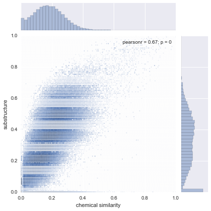
Chemical similarity vs substructure jointplot

As predicted, a positive correlation was found between these two variables. It seemed from the graph that the two were strongly correlated, especially since the p-value was zero. An interesting trend to note was that the data seemed to be banded and centered around certain values. The smaller bands could be due to the fact that substructure data was rounded off to the nearest hundredth place. However, we are not sure of what the large horizontal bands indicate.

Figure 1: Compares chemical similarity to substructure and demonstrates a positive correlation

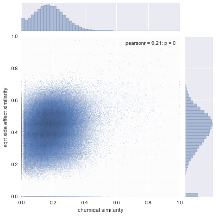
Chemical similarity vs side effect similarity jointplot

The graph demonstrated a positive correlation between chemical compound similarity and side effect similarity. To make it easier to read, we took the square root of side effect similarity values and also used logarithmic bins. With the data transformed this way, the correlation was clearer. Though the correlation coefficient was less than that of the previous comparison, the p-value was zero.

Figure 2: Compares chemical similarity to side effect similarity

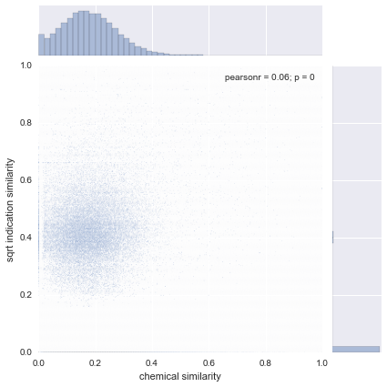
Chemical similarity vs indication similarity jointplot

Though this graph was slightly harder to read than the previous two because of the skewed indication similarity data, the zero p-value showed some degree of significance. Most of the indication values were zero, so even by taking the square root of the values, it was difficult to visualize the positive correlation. We decided to use a different visualization for clearer analysis (see pointplot below.)

Figure 3: Compares chemical similarity to indication similarity

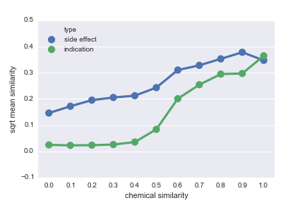
Pointplot

Because the correlation was a bit difficult to read in previous graphs (especially in the indication jointplot,) we used a pointplot for a different visualization. The chemical similarity data was rounded off to the nearest tenth and the mean values for both side effect similarity and indication similarity was found for each subset. This data was graphed on a pointplot which demonstrated a clear positive correlation, especially when the chemical similarity passed 0.4. For the side effect similarity, it was easy to see a steady positive correlation, apart from the fall between 0.9 and 1.0 on the chemical similarity axis. This could be attributed to the small number of data points, however. For the indication similarity, the graph showed no real correlation between 0.0 and 0.3, but a steady upward trend began starting from 0.4. From our graphs we concluded that increased chemical compound similarity did indeed indicate an increase for side effect similarity and indication similarity.

Figure 4: A clearer representation of the association between chemical compound similarity and side effect and indication similarity

Please note that SIDER 4 has just been released.

Before anyone asks: no there has never been a SIDER 3. We decided to jump to version 4 to make SIDER version numbers consistent with STITCH. This means that compound IDs of SIDER 4 are consistent with those of STITCH 4, and that SIDER 5 will be consistent with STITCH 5 etc.

I am a bit surprised to see that you use SIDER as a source of drug indications. As is hopefully clear, the focus of SIDER is very much on side effect information. It should thus be no surprise that the quality of the drug indication information is presumably lower than the side effect information.

It may be worth noting that the work on SIDER actually started as part of a drug-repurposing / off-target-prediction project at EMBL [1].

I do not want to be overly negative, but there is a reason why we only made use of side effects and not indications to calculate drug similarity: it seems very unlikely to me that you would be able to make non-obvious predictions based on the known indications. If drug X is approved for indications A, B, C and D, and drug Y is approved for indications A, B and C, I would consider the prediction that drug Y might also work for indication D to be trivial. Especially if drugs X and Y are similar chemical compounds.

I believe this is the biggest challenge in computational drug repurposing: how do you predict something that is correct and not obvious? In my experience, this turns out to be much, much harder than to predict something that is just correct.

@larsjuhljensen, great timing and thanks for the heads up!

I am a bit surprised to see that you use SIDER as a source of drug indications.

SIDER was one of the first resources we played with for this project. At the time, we decided to investigate the indications because 1) they were there and 2) we were unaware of other indication databases.

Since then we've spent considerable time on creating a catalog of indications. We ended up combining four indication databases, one of which (MEDI [1]) uses SIDER 2 as an input. We have now moved on to a final stage of expert curation.

it seems very unlikely to me that you would be able to make non-obvious predictions based on the known indications.

Our heterogeneous network edge prediction method is a supervised method. Therefore, we need efficacious indications to train our model. However, I do have hope for some metapaths containing an indication metaedge to produce non-obvious predictions. For example,

  • disease A has 3 indicated drugs (X, Y, Z)
  • X, Y, Z elicit similar transcriptional responses (in LINCS L1000 data)
  • W elicits a similar transcriptional response to X, Y, and Z
  • drug W may treat disease A

I agree that repurposing using only the bipartite indication network will produce mostly obvious predictions. However, our approach is capable of much more!

SIDER 4

We have begun working with SIDER 4. See the dedicated discussion for more information.

 
Status: Completed
Views
178
Topics
Referenced by
Cite this as
Daniel Himmelstein, Leo Brueggeman, Sabrina Chen, Lars Juhl Jensen (2015) Assessing the quality and applicability of the SIDER 2 resource. Thinklab. doi:10.15363/thinklab.d30
License

Creative Commons License

Share