Project:
Rephetio: Repurposing drugs on a hetnet [rephetio]

Visualizing the top epilepsy predictions in Cytoscape


We're focusing on epilepsy as case study in our Project Rephetio report [1, 2]. Specifically, we're interested in the top 100 compounds predicted to treat epilepsy.

One way to investigate these 100 epilepsy predictions is to view them in a chemical similarity network. In a previous comment, I exported this visualization from our Hetionet Neo4j Browser. However, now I'd like to pursue this visualization further, so here we'll discuss how to perfect this visualization in Cytoscape [3, 4].

For this project, we've already used Cytoscape to visualize Hetionet. Here we'll be using it for a much more zoomed-in plot!

From Neo4j to Cytoscape

cyNeo4j is a Cytoscape app that allows you to load networks from Cypher queries on a remote Neo4j instance [1]. Sadly, development of cyNeo4j has stalled, but I was able get it to import the compound network from https://neo4j.het.io using two steps:

  1. Query the 100 compound nodes
  2. Query for RESEMBLES_CrC relationships between the 100 compounds

The resulting Cytoscape session is online at compound-network.cys. Here is the resulting visualization:

Chemical similarity network of the top 100 epilepsy predictions from Project Rephetio

Compounds are colored by their effect on ictogenesis — whether they suppress seizures (blue), have an unknown effect (white), or generate seizures (red). Tagging @pouyakhankhanian, as yesterday we discussed additional ways to visualize our epilepsy predictions.

Improving the visualization

I'd like to improve the visualization above.

But before going any further, is a network with 100 labeled nodes too expansive for a manuscript visualization? If we do have labeled nodes — which is really helpful — can we make the labels a readable font size?

One alternative to compound names would be drawing compound structures using chemViz2. We could then made nodes circular or square to conserve space.

I'd also like to make text always fit within a node.

Finally, I'm really interested in drawing rings around the nodes that are composed of colored arcs. Each arc would represent how much a certain target of the compound contributed to the prediction (following from this comment).

Cytoscape 3.4.0 has a ring chart. Alternatively, the enhancedGraphics app [1] has circle/circos charts that may do the job. I briefly tried out the builtin ring chart but couldn't get the rings to surround the "round rectangle" node shape — instead the rights were drawn inside the nodes.

Tagging @sergiobaranzini & @alexanderpico — two experts of Cytoscape. Any suggestions?

The network displayed above is already interesting. There is a clear barbiturate cluster and a clear benzodiazepine cluster. The tricyclic antidepressants (TCAs) cluster together as well in the lower right, and are colored pink because they are ictogenic. Overall, I think this is a good figure with a lot of information.

We discussed adding more layers of information, specifically to use the edges. I would be in favor of trying to display the source edge information. Specifically, I'm interested in the times when the source edge is Compound-Gene. The reason for this is that I was particularly amazed at how many of the "modern epilepsy genes" (the SCNs, the CACNAs, the GRIN/GRIK/GRIAs, KCNs) were included as source edges (note that these are not target edges, these genes are too modern and were presumably not included in the network as gene-epilepsy edges). In particular, I'd want to see if there is some clustering of drugs based on what gene target they act one. This may serve to reclassify the AEDs, a class of drugs which has historically been difficult to classify cleanly. I showed this to Ingo Helbig an epilepsy geneticist who shared my interest, hope he can join thinklab to share some of his insight.

Regarding the use of chemical shapes rather than names, I personally prefer the names. I would never be able to pick out patterns in chemical shapes, but names for me reveal obvious clusters. Consider 3-letter abbreviations for drugs if you want to decrease the size of the text label (there are pretty standard 3-letter abbreviations for epilepsy drugs, we would have to create 3-letter abbreviations for the other drugs, CBZ: Carbamazepine, LTG: Lamotrigine, OXC: oxcarbazpine, VPA: sodium valproate, TPM: Topiramate, CLB: clobazam, GBP: gabapentin, LEV: levetiracetam, PHT: Phenytoin, TGM: tiagabine, ZON: zonisamide, PGN: pregabalin, ESM: Ethosuximide, CLN: clonazepam, RUF: rufinamide, VGB: vigabatrin).

Hope @sergiobaranzini and/or @alexanderpico can help with the visualization.

In terms of Cytoscape tips, you're on the right track with enhancedGraphics. There is a new version coming soon that will provide more label options as well, like drop-shadows, to make them easier to read on various backgrounds. You can email Scooter at scooter@cgl.ucsf.edu for an advanced copy if you want to try it now.

Circle charts only work with circle nodes, as far as I understand, so you'll have to compromise between labels inside rectangles and circular data graphics. Alternative would be striped chart within the rectangle that would "fill" from left to right per the contribution to the prediction, i.e., in 3-5 stages (depending on what your data look like).

I would shy away from showing compound structures for all the nodes in this example, since there are so many. If it make sense, you could show selected structures to make particular points.

Version 2 with target piecharts

Thanks @alexanderpico and @pouyakhankhanian for the feedback. Here's the latest version that shows the normalized contribution of each target (gene group) to the prediction. It's way more informative and interesting than before (and hopefully still legible)!

Predicted epilepsy compound network

Making the legend was a pain. I had to first choose colors, which I selected from d3's category10. Then I manually applied the colors to the Cytoscape chart options. However, I couldn't generate the legend in Cytoscape, so I used ggplot2 in R and pieced together the SVG exports in Inkscape. So lot's of opportunity for errors and difficult to automate.

Alternative would be striped chart within the rectangle that would "fill" from left to right per the contribution to the prediction

@alexanderpico great idea regarding a striped chart within the node. Unfortunately, I couldn't find any other good properties besides fill color for representing the compound's effect on ictogenesis, which the striped chart would displace.

In particular, I'd want to see if there is some clustering of drugs based on what gene target they act one.

@pouyakhankhanian hopefully this is now within reach. The raw data for the piecharts is available in target-contributions-wide.tsv if anything is hard to see in the network.

I manually laid out disconnected compounds. The visualization could be improved by placing similar compounds together. For example, I placed sevoflurane with the other halogenated ethers even though it's chemical similarity was not strong enough to have any resembles relationships. So @pouyakhankhanian, feel free to play with the cytoscape session to help organize things.

  • Lars Juhl Jensen: With all due respect, I think you have overloaded your visualization with properties. By having so many different properties visualized in a single figure, it is near impossible to spot any patterns. The art of visualization is to highlight what is important; the way to do that is by not showing what is not important.

Cytoscape in the web browser?

Obviousely, having the above visualization as an interactive web visualization would be super cool and useful. I've heard about cytoscape.js [1] which is designed for this purpose. Hence, I exported the visualization from Cytoscape to a webpage [2] with the commands:

File > Export > Network View(s) as Web Page

After unzipping the export, I launched a webserver using Python 3 (python -m http.server). The resulting webpage, hosted locally, showed an interactive version of the initial graph. Awesome! Unfortunately, the pie charts were not included in the visualization.

One final feature I'd like to implement that cytoscape.js may support is node hyperlinks. So for example, clicking the Isocarboxazid node would navigate you here. Scripted editing of the SVG may also be a viable option here.

  • Pouya Khankhanian: Unfortunate that the links and pie charts don't work. Still I think the links you provide to cytoscape and neo4j allow quite a bit of interaction. It is not ideal but it is better than what we've had for a lot of projects.

It's incredibly busy but I really do find it quite informative. The big benzo cluster on the upper right is clearly GABA heavy. The other big cluster is the barbituate cluster on the bottom, just left of center. This cluster is GABA/glutamate/Choline heavy. The halogentated ethers on the bottom right (I guess sevoflurane was not connected but moved closer for clarity) are also interesting, they seem to have potassium channels in common as well as GABA.

Perhaps one of the most interesting clusters is the TCA (tricyclic antidepressant) cluster. We can tell they are ictogenic because they are shaded pink. It's interesting that these seem to share the CYP genes in common. Recall that CYP genes are actually not mechanistically related to epilepsy, but it just so happens that many seizure meds interact with the CYP protein. I'm a little surprised that there is not as much GABA in this cluster.

The carbonic anhydrase inhibitors are clustered and are associated with the carbonic anhydrase proteins as expected.

One very note-worthy thing is that the hetionet was not a prior "aware" of all these genes that are associated with epilepsy (i.e. there was no direct gene-disease connection in the network for most of these genes), and yet it still used these epilepsy genes to make it's predictions. The likely reason that genes associated with epilepsy were not connected to epilepsy via a gene-disease connection is because these are very rare mutations, most of these genes have been reported in only a handful of people. @dhimmel any thoughts about using this network for gene discovery? (sounds like a rabbit-hole though)

I have made an alternative suggestion for the pie chart figure:

compound-network-ljj
What I changed was to make the nodes be just the pie charts, move the text labels to not be on top of the pie charts (to improve readability), recolor the pie charts using a color scale from ColorBrewer, and reduce edge width to reduce clutter.

@larsjuhljensen thanks for the suggestions. I'm excited about reducing clutter and improving readability. Stay tuned for a version that incorporates your modifications.

there was no direct gene-disease connection in the network for most of these genes

@pouyakhankhanian, I'm not so sure about this. You can run the following query at https://neo4j.het.io to see all epilepsy-associated genes in Hetionet v1.0.

MATCH (disease:Disease)-[assoc:ASSOCIATES_DaG]-(gene:Gene)
WHERE disease.name = 'epilepsy syndrome'
RETURN
  gene.name AS gene_symbol,
  gene.description AS gene_name,
  assoc.sources AS sources
 ORDER BY gene_symbol

I suspect these 399 associations contain many of the "very rare mutations … reported in only a handful of people" that you're thinking of. Quoting our report:

Disease–associates–Gene edges were extracted from the GWAS Catalog [1], DISEASES [2, 3], DisGeNET [4, 5], and DOAF [6, 7].

I think DISEASES, DisGeNET, and possibly DOAF are capable of containing associations based on rare mutations that were discovered prior to ~2015.

Another way we can approach the issue is by looking at the contribution of Epilepsy–associates–Gene (target edges) on our top 100 predictions. This table shows how much each gene group that was associated with epilepsy contributed to the top predictions. The gene groups with contributions greater than 1% are shown below:

Gene GroupPathsContributionGenes
gamma-aminobutyric acid (GABA) A receptor233476.834GABRA1, GABRA5, GABRB2, GABRB3, GABRD, GABRG2
glutamate receptor201422.2849GRIA1, GRIA2, GRIA4, GRIK1, GRIK2, GRIK5, GRIN2A, GRIN2B, GRM1, GRM2, GRM3, GRM4, GRM5, GRM8
sodium channel26782.1133SCN1A, SCN1B, SCN2A, SCN3A, SCN4A, SCN8A, SCN9A
calcium channel102091.5873CACNA1A, CACNA1D, CACNA1G, CACNA1H, CACNA2D2, CACNB4, CACNG2, CACNG3
potassium channel154671.547KCNAB2, KCNB1, KCNC1, KCNC4, KCND2, KCNH1, KCNJ10, KCNJ11, KCNK3, KCNK9, KCNMA1, KCNQ2, KCNQ3, KCNQ4, KCNV1
cholinergic receptor133971.5254CHRM1, CHRM2, CHRM3, CHRNA2, CHRNA4, CHRNA7, CHRNB2
cytochrome P45093651.1146CYP11A1, CYP2C19, CYP2D6
carbonic anhydrase12680.79162CA13, CA4

These are the same gene groups as the source edge analysis identified. However, in this list, the cytochrome P450 family is demoted, as it's the only group that's not mechanistically related to epilepsy pathophysiology.

Version 3 to decrease clutter

Based on @larsjuhljensen suggestions, I created the next iteration of the visualization (compound-network.cys):

Top epilepsy prediction viz

Nodes are now entirely their target-contribution piechart. Ditching the rounded rectangles and moving the text atop nodes saved space. The compound names will still be small but should be readable at printout size. I moved the effect on ictogenesis to the node border, since I think this information is crucial.

I also moved the disconnected nodes around to put similar compounds (either by name or target contributions) together.

Of course, suggestions still welcome.

I find it is too packed and that it is thus hard to spot clusters because there are nodes everywhere. I would make the figure taller to get some more real estate and rearrange the nodes so that there is some free space between your clusters. There is an element of horror vacui to this visualization; white space should be your friend.

And sorry to be so negative, but I still find the figure to overloaded in terms of visual properties. Maybe the effect on ictogenesis is important to show, but in that case you'll have to remove something else. Right now, by attempting to show everything at the same time, you in my opinion effectively end up showing nothing.

Here are some questions to consider for improving the figure further:

  • What is the main conclusion that you want people to draw from looking at this figure?
  • You have two types of effect on ictogenesis coded in light blue and light red. Are both equally important? If not, could you maybe just highlight the one that is important?
  • Part of what makes this hard to look at is the number of target classes. By having so many classes, you use up a lot of color space, making it hard to show anything else. Could some classes be left out? Could some be combined (e.g. calcium channels + potassium channels + sodium channels = cation channels)?
  • Are the relevant target classes shown? When I try to find the target class that best discriminates between nodes with red circles and nodes with blue circles, it appears to be the class "other". This suggests to me that, despite showing so much, you are in fact not showing what matters most.
  • And last but certainly not least: are you sure this should even be shown as a network? Your focus seems to be all kinds of properties of the nodes, whereas the edges barely matter, except for showing that there are certain groups of chemically similar compounds. Simply categorizing the compounds might be a much better way to represent this.

Just trying to be constructive here.

Sorry to be late to the discussion! One thing you may want to try is using an edge-weighted layout like the one below. I added the 2D structure diagrams using chemViz2, as an example, but I frankly wouldn't recommend it — I think that the pie charts are more informative and you would have to zoom in pretty far to be able to see any of the differences in the compound structures. The edge-weighted layout does show some subtlety that is lost on the more compact representation IMHO, but at the cost of reduced visibility of individual nodes.
Edge Weighted Version

Version 4 three panel format

Thanks @larsjuhljensen and @scootermorris for the help. Your comments help guide this iteration. Unfortunately, I have little more time to work on this visualization, so while I'll appreciate more suggestions, I may not incorporate them here (although they'll guide my future thinking).

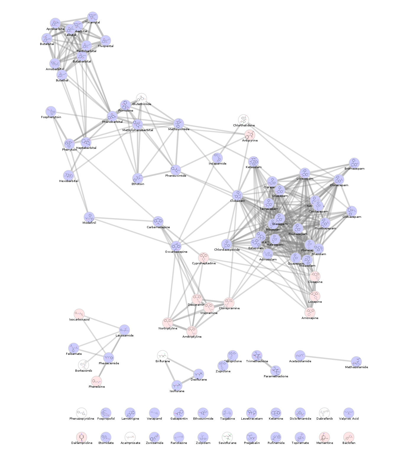
The new version contains three panels (pdf, session). Panel A shows the ranked top 100 epilepsy predictions, colored by their effect on ictogenesis (more info). The curve denotes the predicted probability of treatment. Panel B shows the structural similarity network for these compounds with structures drawn. Panel C is the same network and layout as Panel B, but shows target contributions as pie charts.

compound-network-combined

Thanks @scootermorris for having made layoutSaver, which saved me lot's of time by syncing the node positions between the structure and target networks.

@larsjuhljensen call me a kenophobe 😉, but I do think minimizing space usage, especially with this monstrosity, is important. I agree that the extra space and grid alignment of your figure improve the aesthetics and readability. However, I couldn't achieve the correct dimensionality (printable and readable on a single page) without a bit of horror vacui.

What is the main conclusion that you want people to draw from looking at this figure?

The figure is supposed to provide pharmacological context to our top 100 epilepsy predictions. It's certainly exploratory — there are a few conclusions we'll point out, but I'm hoping the viewer will be able to generate their own observations or questions. In part, this figure helps us answer our own questions as well.

You have two types of effect on ictogenesis coded in light blue and light red. Are both equally important? If not, could you maybe just highlight the one that is important?

All three categories (red, blue, white) are crucial.

Part of what makes this hard to look at is the number of target classes. By having so many classes, you use up a lot of color space, making it hard to show anything else. Could some classes be left out? Could some be combined (e.g. calcium channels + potassium channels + sodium channels = cation channels)?

Something I'll consider. The categories were automatically generated and ordered. I like showing how we detect almost all of the bonafide anticonvulsant targets.

Are the relevant target classes shown? When I try to find the target class that best discriminates between nodes with red circles and nodes with blue circles, it appears to be the class "other". This suggests to me that, despite showing so much, you are in fact not showing what matters most.

Still have to look into the ictogenic compounds more in light of this visualization. The fact that our method cannot differentiate the ictogenic compounds is a shortcoming, although one that is important to highlight and that we are comfortable with.

And last but certainly not least: are you sure this should even be shown as a network? Your focus seems to be all kinds of properties of the nodes, whereas the edges barely matter, except for showing that there are certain groups of chemically similar compounds. Simply categorizing the compounds might be a much better way to represent this.

It's not imperative that's its shown as a network. But I do think a 2-dimensional projection of the compounds that places similar compounds together is most effective. A network of chemical structure seemed like the easiest way to get there.

 
Views
95
Topics
Referenced by
Cite this as
Daniel Himmelstein, Pouya Khankhanian, Alexander Pico, Lars Juhl Jensen, Scooter Morris (2017) Visualizing the top epilepsy predictions in Cytoscape. Thinklab. doi:10.15363/thinklab.d230
License

Creative Commons License

Share